Feeds:
Posts
Comments

Law firms are famous, in printing circles, for going for the most conservative looks possible in design and printing. White or cream paper, black or navy ink, plain, plain fonts, no fuss, no muss. The printing and paper are chosen to convey a message of stability and strength. Shannon Bailey came to me several years ago and wanted to crack that open a bit while still attending to the tacit rules followed by most of the profession. We stuck with the no fuss part, slightly veered away from the usual color palate, yet declared something feminine in the shape of the letters and the unusual (for lawyers) letterpress presentation. The florescent white, 100 percent cotton Cranes Crest paper and a charcoal gray ink carry the gorgeous typeface called Nicolas Cochin, originally designed by Georges Peignot in 1913. The design was based on the eighteenth century engravings of Nicolas Cochin. It is a subtly dramatic serif letter that lends something lively to an otherwise stately mode. The subtle indentation of each letter left by the raised surface of letterpress type fills in the rest of the impression, abetting the message of strong lawyerly professionalism: This is an attorney who attends to every detail with vigor and verve; she cares.

Subtle impression left in the paper by the raised surface of letterpress type calls attention the shape of each letter. Square flap envelopes reference generous attention to detail.
Letterpress stationery wardrobe.
Shannon Bailey sent these announcements out when she opened several years ago.

Aaron Micu has built his thirty-year career the way artisans of the old world became masters of their trade, and the same way I learned my trade in letterpress printing. He apprenticed under some of the most revered designers in the world of interiors and I apprenticed under a master printer. We connect on that level, as well as on so many others. His aesthetic speaks of exquisite drama underpinned by deep knowledge and inherent good taste, while his magnetic personality grounds everything in kindness, intelligence, and fun. His business cards and stationery wardrobe mirror all that. See his gorgeous design work at wwwaaminteriordesign.com.

Letterpress Business Card with Gold Foil printed on Somerset English watercolor paper

Aaron Micu’s Business Card

Stationery Wardrobe: Letterhead, Envelopes printed on Cranes Crest 28 pound 100% cotton stock, Script Cards printed on Somerset watercolor paper

IMG_6459IMG_6460

IMG_6461

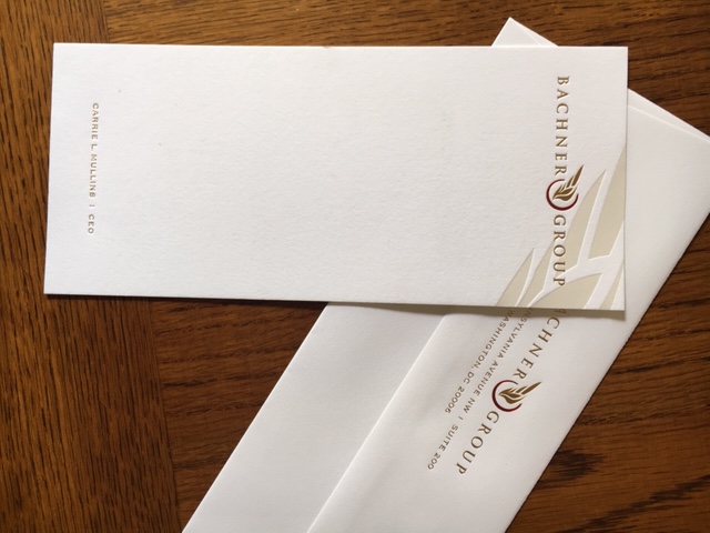
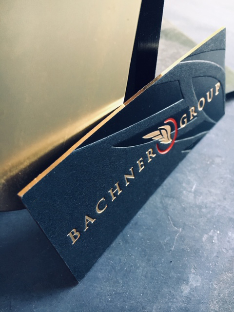
We made up these gorgeous script cards and envelopes for one of the nicest clients we’ve ever had, Carrie Mullins, CEO of Washington, DC consulting firm, The Bachner Group. Carrie looked far and wide and tried many printers in search of business cards and script cards that would flout the masculine/drab/understated/button-down look of most stationery and design in her field. She found us here on our blog and website, bringing this quite beautiful logo she’d worked long and hard to perfect. She had been looking for someone who could make it really sing. Instead of using ink, we interpreted it in three metallic foils, gold for the type and smaller wing, pearl for the background wing, and deep red for the circle around the smaller wing.

Sing, sing, sing!

IMG_6468

They gleam, they glint, they are unabashedly feminine and powerfully bold, filled with a dynamic rhythm that discloses undercurrents of the powerhouse she is.

IMG_6472

The business cards turn the color scheme upside down. Printed on super-thick black museum mount in gold, red, and gloss foils, their gold foil edge gilding further dazzles the eye and startles the status quo out of its gray rut.

As always, out-of-the-box moxie shakes up the room.

IMG_6471

IMG_6474

IMG_3944

A happy birthday party for her husband brought our long-lost, always-wonderful client, Helen MacKenzie, back to us last month. As usual, it was a total pleasure brainstorming with her over the perfect wording, perfect image, perfect design for a party that would feature a bagpiper at the entry door, balloons covering the ceilings, gracious and non-ordinary catering, and a good reason to get out your tux…or kilt.

IMG_3973

The first things she told me, as we began our explorations, were that David loves, I mean LOVES, penguins! And he LOVES RED. Oh boy, appropriate clues revealed. I started searching for penguin images, and, as Helen observed, the thing that’s generally wrong with penguin images is that they are either too cute or anthropomorphic, or too realistically penguinish. I found the perfect thing on Etsy, from poordogfarm, in Pennsylvania: this Penguin Queen had just the right insouciance.

IMG_3974

We tipped her onto our gorgeous 600 gsm Lettra paper with a brilliant RED letterpressed “dent,” which framed her ironic and regal presence quite dashingly. Rhea Rynearson, our printer extraordinaire, applied deep impression to the raised text, giving each letter a little shadow, the shadow we live for in Letterpress Printing. Rhea is the most talented printer, and I’ve known a lot of printers, including even ME.

Gleefully inviting friends to a Swanky Soiree, admonishing them to Dress To Kill (Rhea’s favorite thing she ever had to apply to paper!), and sending the thick, luxurious, practically frameable invitations to invitees’ actual mailboxes gave the entire affair an air of the absolutely-cannot-miss-this, and at the same time, just hilarious fun, which, Helen tells me, carried over to the real party. A blast was had by all.

IMG_3945

IMG_1177

We just finished designing and printing letterpress business cards for a wonderfully talented new arrival to the Mendocino Coast. Karen McGrath brings many years of knowledge and experience in planning outdoor spaces in Redding, California, where her client base included residential and commercial property owners, contractors, architects, interior designers, and fans of every stripe. Her intelligent use of space and luxurious landscaping instincts will be put to good use in our cool, moist climate. She’s excited to work with our coastal cornucopia of cool weather loving plants.

And she loves her new Studio Z Mendocino letterpress cards like crazy:

MGC side view

We printed them on 600 gsm Lettra in a very deep, forest-y green ink, then foiled the word GARDEN in some kind of indescribable pale green metallic foil. You can see the gleam in the rather moody photo above.

The backs are printed in ink except one little botanical dingbat is done in foil:

back bc

The frosting on this delicious cake was a green edge, which perfectly matches the foil.

IMG_1179

MGC front photo

Deep, deep impression, super-thick paper, chic-but-slightly-whimsical typography, a bit of bling, a certain spirit in it: the cards describe Karen’s outgoing personality and gorgeous work. We aim for this effect, this matching what we do to graphically signal what you do with subtlety and verve, and are always gratified when we nail it for our clients. We feel lucky that Karen has chosen to move to the coast, too.

Save

fullsizerenderFernando Crosara is a genius of fine upholstery. He learned his arcane craft with Italian master upholsterers and brings his most persnickety, perfectionist traditional talents to the US via his birthplace in Brazil. He can reupholster ANYTHING and make it new again. Better than new. He’s also the handsomest man in the world, just saying.

I felt lucky to get to make his new logo, which I completely love for its simplicity, modernity, and even if I do say so myself, cleverness. See what’s going on? A circle turns into a monogram C and D. Have I mentioned how very much I love designing monograms? LOVE.

img_0813

We chose to do digitally printed cards with a glossy finish to set off the chic black-and-white design. Less is more, less is more, less is more.

(The little spotted plate is by a local ceramicist whose last name I forgot. Her first name is Lizzie and I’m crazy about her work! You can find it at the Artists Coop in downtown Fort Bragg.)

Knoxville photographer David Payne called one day last year and wanted to talk about business cards. I can talk about business cards all the live-long day, so we had a  conversation that ranged from printing and design to photography, cars, weddings, and the fact that I’ve long wanted to visit Knoxville, Tennessee. Etc. When two talkers get on the phone, you can expect some communication to occur.

Specifically, he was ready for a drop-dead-amazing business card, had encountered the Studio Z Mendocino website and blog, and thought I was the right person for the job. That’s always a lovely thing to hear, of course, and it was a pleasure to describe what my work is to someone as perspicacious as this new customer/friend David Payne is. He really got it — like, everything! I think that’s why he’s a great photographer, too. He gets it. He feels it. And he intends it. IT being excellence, devotion, a work ethic, aesthetics, the power of image and beauty, the pleasure of conversation.

I immediately got to work designing his new logo, which is a ‘dp’ inside a box that you can spin on its head and it’s still the same. We went back and forth with some ideas about color, type faces, and what you see above is the happy result, printed perfectly by Rhea Rynearson.

When the actual printing part started, though, that’s when we ran into some snags.

We got busy ordering his gorgeous, super-thick Cranes Lettra paper, the foil die and beautiful, sheer pearl foil, the film for the type on the back, the plates, the this, the that…minutia that make up what happens with letterpress that we are so used to and that usually goes very smoothly. Not every story has a straight-through trajectory, however. There were some illnesses, there were this hitch and that hitch, and in the end, I can only say, sorry… it took a long time. David was never-endingly patient, bless him. He was incredibly nice and understanding about every single thing and just kept his eye on the prize that he wanted. In the end, after everything, they got delivered and he sent me this email:

“Cards came in. They are PERFECT!!!!!!!”


Splendiferous!

Splendiferous Boutique’s letterpress, gilt-edged business cards — oh la la!

Studio Z Mendocino

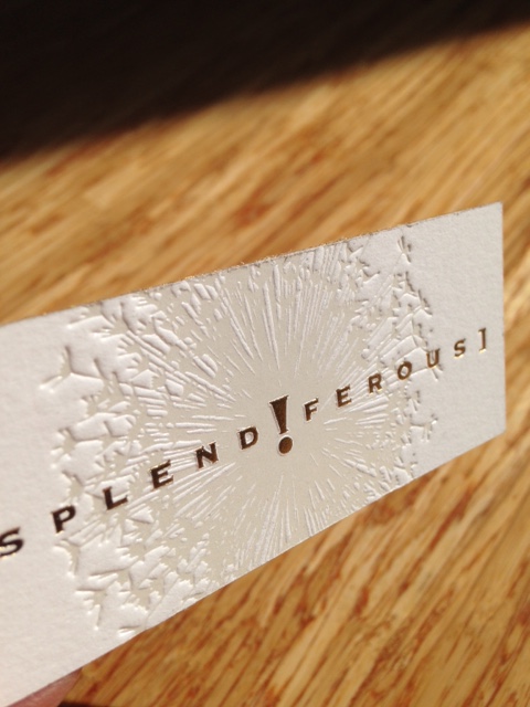
gold edge cardsMonica Wellington’s impossibly fabulous SPLENDIFEROUS women’s clothing boutique, on Fort Bragg’s most fashionista-friendly Laurel Street, needed a new business card. The last one I had designed for her was a little bit funky (thick kraft paper), a little bit swoozy (ultra-wild typesetting), and had served its purpose well for several years.

IMG_0478Super cute, right?

Now, almost out of the old ones, she wanted something to match the way Splendiferous! had evolved over the ensuing years, to 2016. Monica wanted to keep the dandelion puff we’d always used, and she still loved “Splendiferous” spelled with an exclamation point in place of that “i,” in the middle, but it needed a new, sleeker, chicer, more uber interpretation that befit how the shop is now: Ultra-glorious.

2016 bc black front

Monica couldn’t make up her mind whether she loved white paper or black paper. Each gives off such a different vibe. So, of course, in line with…

View original post 206 more words

Salvador Baby Announcement

This birth announcement for baby Salvador was printed on luxuriously thick and subtly textured 600 gsm Cranes Lettra so we could take full advantage of letterpress’s characteristic impression. The rectangular dent at the top makes a frame for the tipped-on photograph. Printed by Rhea Rynearson for us, the 100 5″x7″ announcements and matching envelopes were around $10 a piece, including shipping to Europe. Salvador’s parents told me that their friends and family loved it. And how could they not? It helps to have the most beautiful baby in the world, too.

The dent makes a frame

The dent makes a frame where the photo nestles. Tipped-on or tipped-in means a separate piece is glued to the paper, giving one more textural point of interest.

deep impression

It’s all about texture. The inked type sinks deeply into the very thick paper and leaves a little shadow around each letter and number. This is how you identify letterpress. A beautiful way to tell the world your darling new child has come into the world.

Splendiferous!

gold edge cardsMonica Wellington’s impossibly fabulous SPLENDIFEROUS women’s clothing boutique, on Fort Bragg’s most fashionista-friendly Laurel Street, needed a new business card. The last one I had designed for her was a little bit funky (thick kraft paper), a little bit swoozy (ultra-wild typesetting), and had served its purpose well for several years.

IMG_0478Super cute, right?

Now, almost out of the old ones, she wanted something to match the way Splendiferous! had evolved over the ensuing years, to 2016. Monica wanted to keep the dandelion puff we’d always used, and she still loved “Splendiferous” spelled with an exclamation point in place of that “i,” in the middle, but it needed a new, sleeker, chicer, more uber interpretation that befit how the shop is now: Ultra-glorious.

2016 bc black front

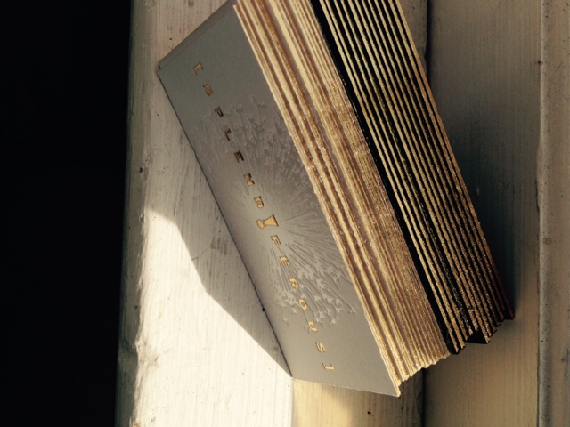
Monica couldn’t make up her mind whether she loved white paper or black paper. Each gives off such a different vibe. So, of course, in line with my motto, If it’s worth doing, it’s worth OVER-doing: I printed her new designs on BOTH–half on white Cranes Lettra 600 gsm, and half on black super-thick, thick, thick, amazing Museum Mount papers, and then, of course, we gilded the lily…

IMG_0098

Oh, gee. What can you say? Gold, metallic edge gilding.

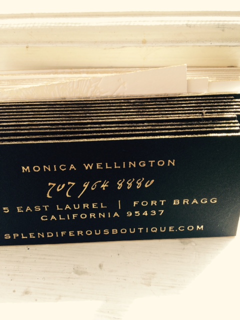
On the white paper, we used a pearlized white foil for the puff and on the black paper, we used gloss black foil for the puff. Everything else was in gold foil. Everything else was just, you know, splendiferous.

Here’s the back.

2016 bc back

Next time you are in Fort Bragg, you HAVE to go shopping there.

You can order YOUR over-the-top, gilded-lily business cards from Studio Z Mendocino whenever you’re ready for the Next Step. 707.964.2522. These cards are very expensive, it’s true ($1.70 each for 1000 — and no, getting 100 doesn’t work to lower the cost, those would be well over $5 each), but they are worth every cent for the astonishment these little pieces of art provoke in potential clients, the curiosity, and the perfectly fitting vibe. If you’re going to have an ambassador out in the world representing you, it had better be capable of the heavy lifting your high-end clientele expects.

2016 white front