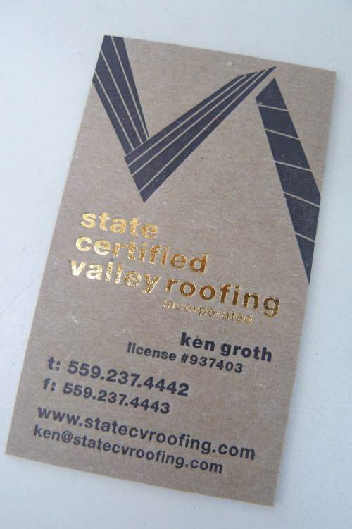
Jeannie Chapman has been one of our favorite clients for many, many years. We loved working on her Buffalo Road Design business cards way back in the ’90s, which used brown ink and copper foil. When she called last year to have us design a new logo for her husband Kenny Groth’s new roofing company, State Certified Valley Roofing, in Clovis, California, she asked if I thought I could incorporate that copper foil into his new things too. We love the glint of metal, of course, since a little bling, even as it applies to a roof’s copper flashing, is always yummy, so I kept that in mind as I went into my creative trance over what a cool roofing logo would look like. The first drafts were just type, quite conservative typography, and went through a few iterations that looked like this:
Which is nice, but not the big whoop I was going for. I started doodling with the concept of a “roofline,” using lines and keeping in mind the copper element I would be bringing in. Not too literal, mind you, I wanted a bit of freedom in the line. So that phase started in this direction:
After quite a few drawings and fooling-arounds I came to this design, and, going with the idea of how roofs look, I decided we should print everything on chipboard and kraft paper. The finished piece you see at the top of this post and below came out in the love-love-kiss-kiss department:
Gnarly old chipboard, very thick, juxtaposed with a masculine aesthetic and just a touch of bling…YES!
Here are the stationery and envelope designs that ensued from the business card and logo musings:
The letterhead has a sort of “stain” of the roofline motif that stretches dramatically over the entire sheet:
We are crazy about this stationery wardrobe and Jeannie is too.


